


Every designer has admired the no-nonsense lettering of the American vernacular, those letters of paint, plaster, neon, glass and steel that figure so prominently in the urban landscape. From these humble beginnings came Gotham, a hard-working typeface for the ages.
The Gotham typeface was designed by Jonathan Hoefler and Tobias Frere-Jones in 2000. A sans serif that shares many attributes of typography’s ‘geometric’ genus, Gotham was inspired by a style of bold capital letters that evolved outside the typographic tradition in the early twentieth century, common to lithographed posters, enamel signs, and commercial facades throughout New York City. First appearing in the pages of GQ magazine in 2001, Gotham gained international attention in 2007 when it was adopted by the presidential campaign of Barack Obama. One of the most popular and influential typefaces of our time, Gotham is in the permanent collection of the Museum of Modern Art in New York.


Related products

Avenir Next
$24.99
Dattacle Variable
$0.01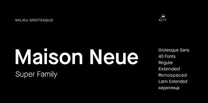
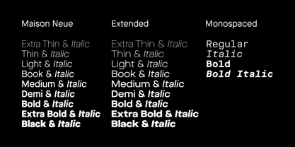
Maison Neue
$99.99
Moriz
$0.01
Oberland
$2.00
Oberland
$2.00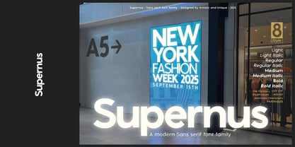
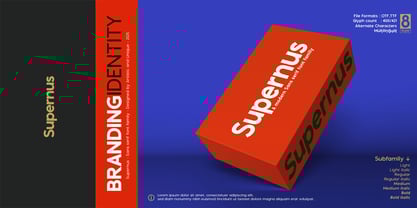
Supernus
$24.89
Reviews
There are no reviews yet.